Articulate Global, LLC
Design Toolkits
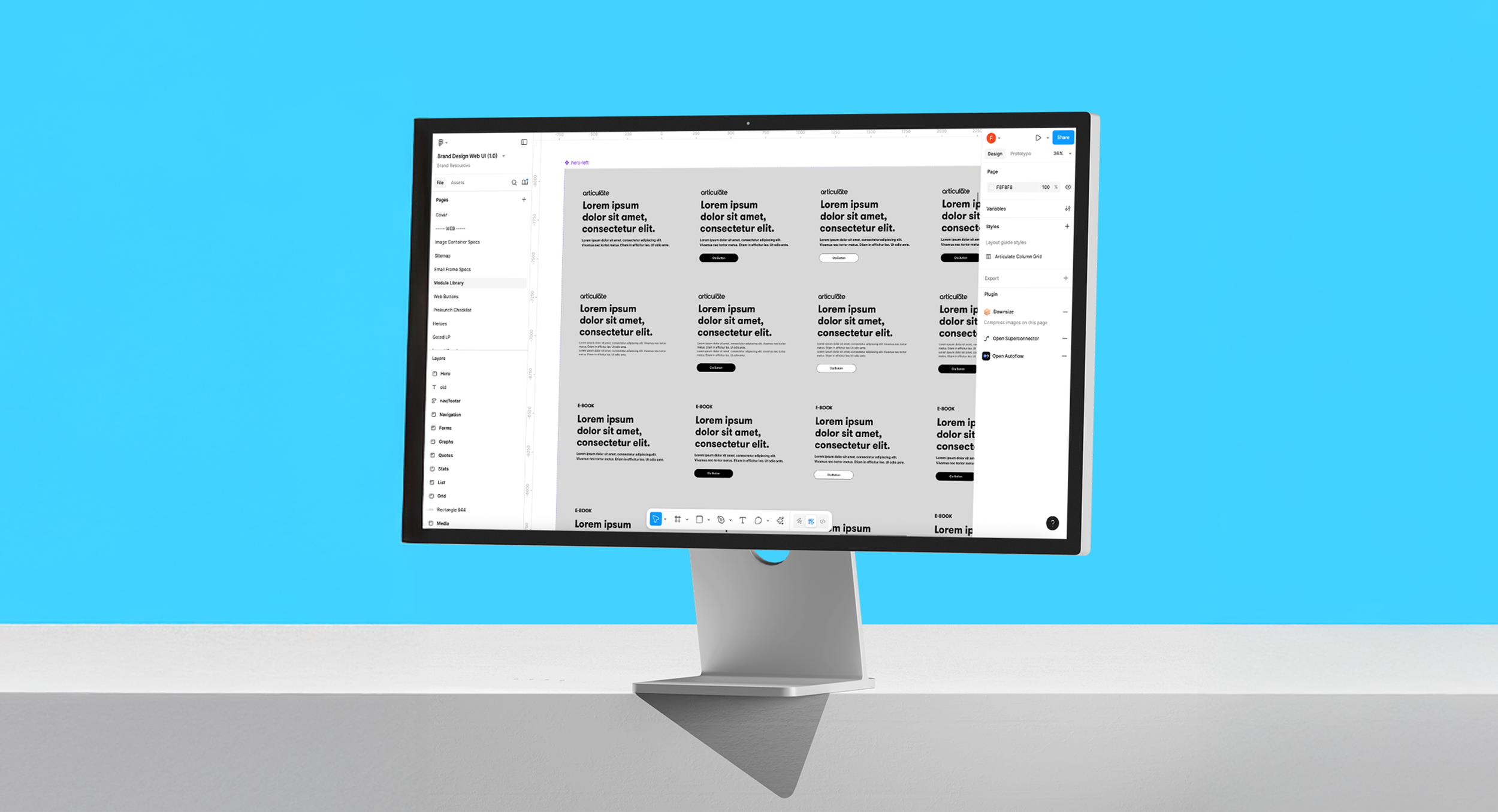
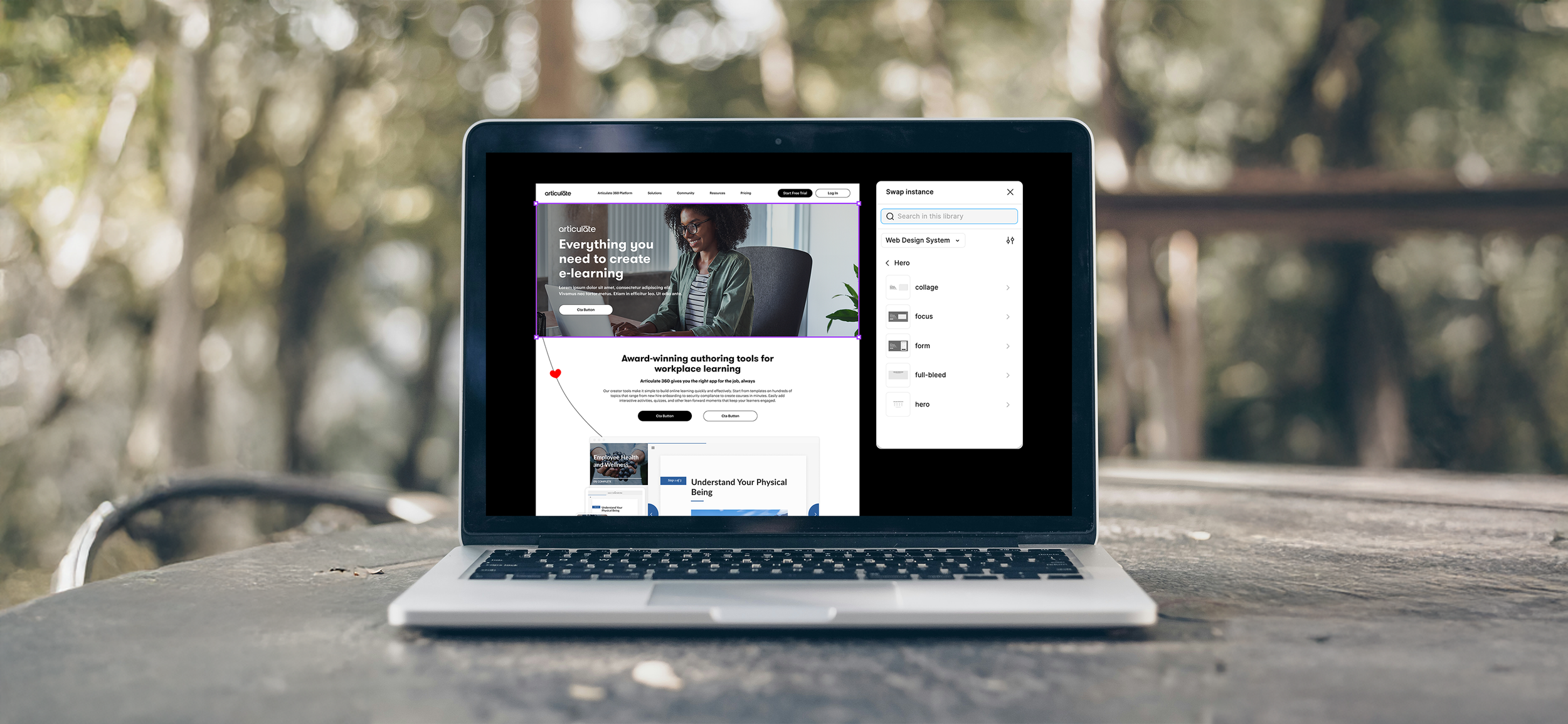
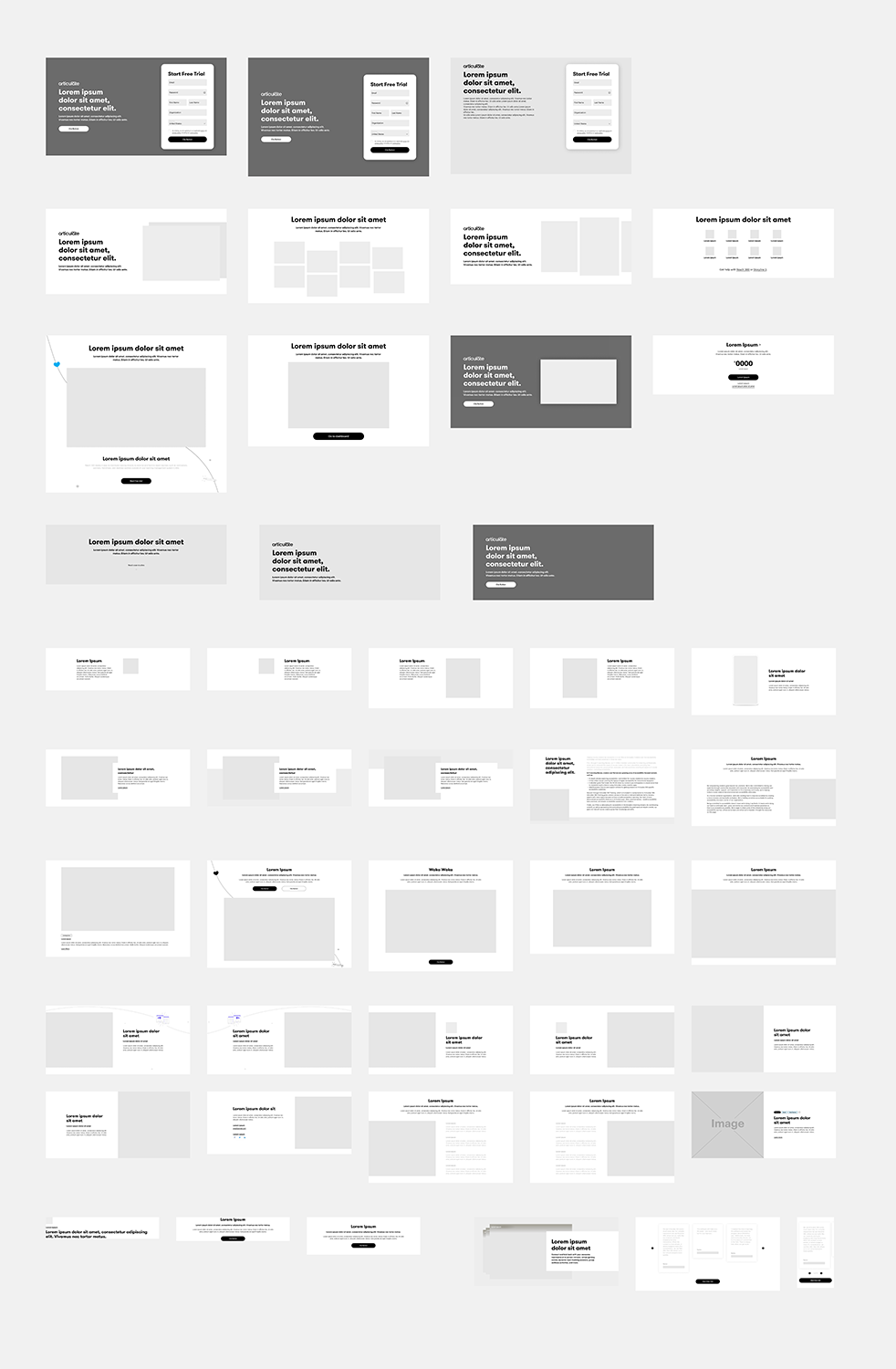
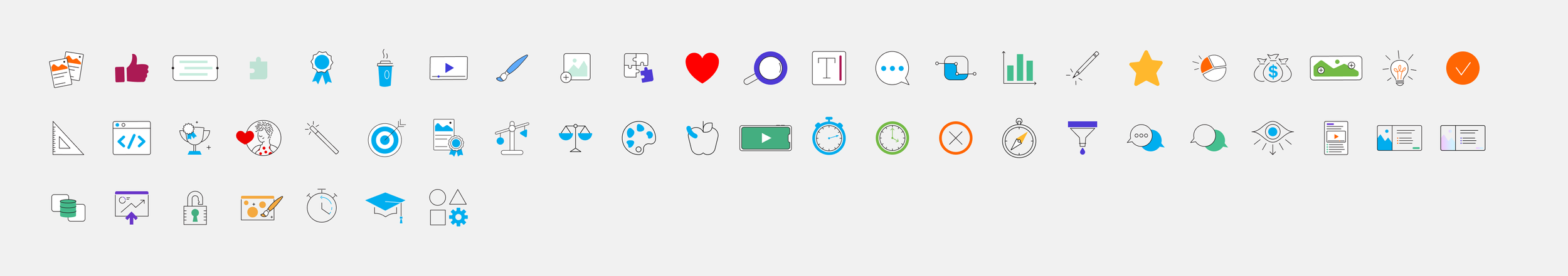
Previously, designers had to source brand elements from various files and designs in order to maintain consistency across projects. To address this challenge, I was tasked with developing component libraries for brand and web teams, within Figma, that consolidated these resources, enabling our team of brand designers to create more consistent and cohesive designs. This component library included:
Logos
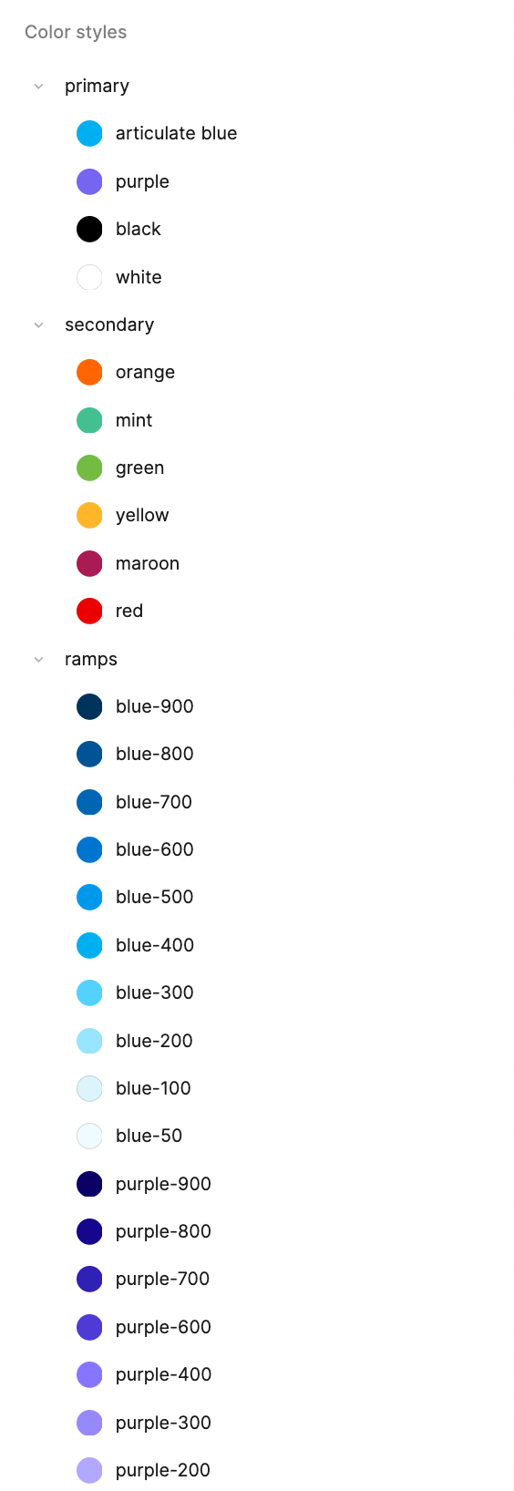
Color styles
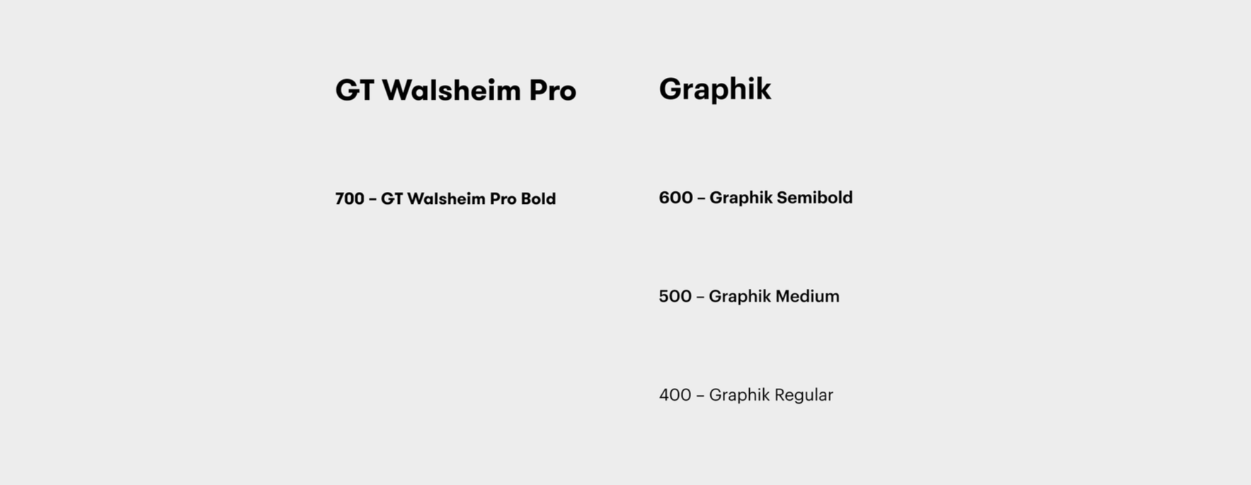
Font styles
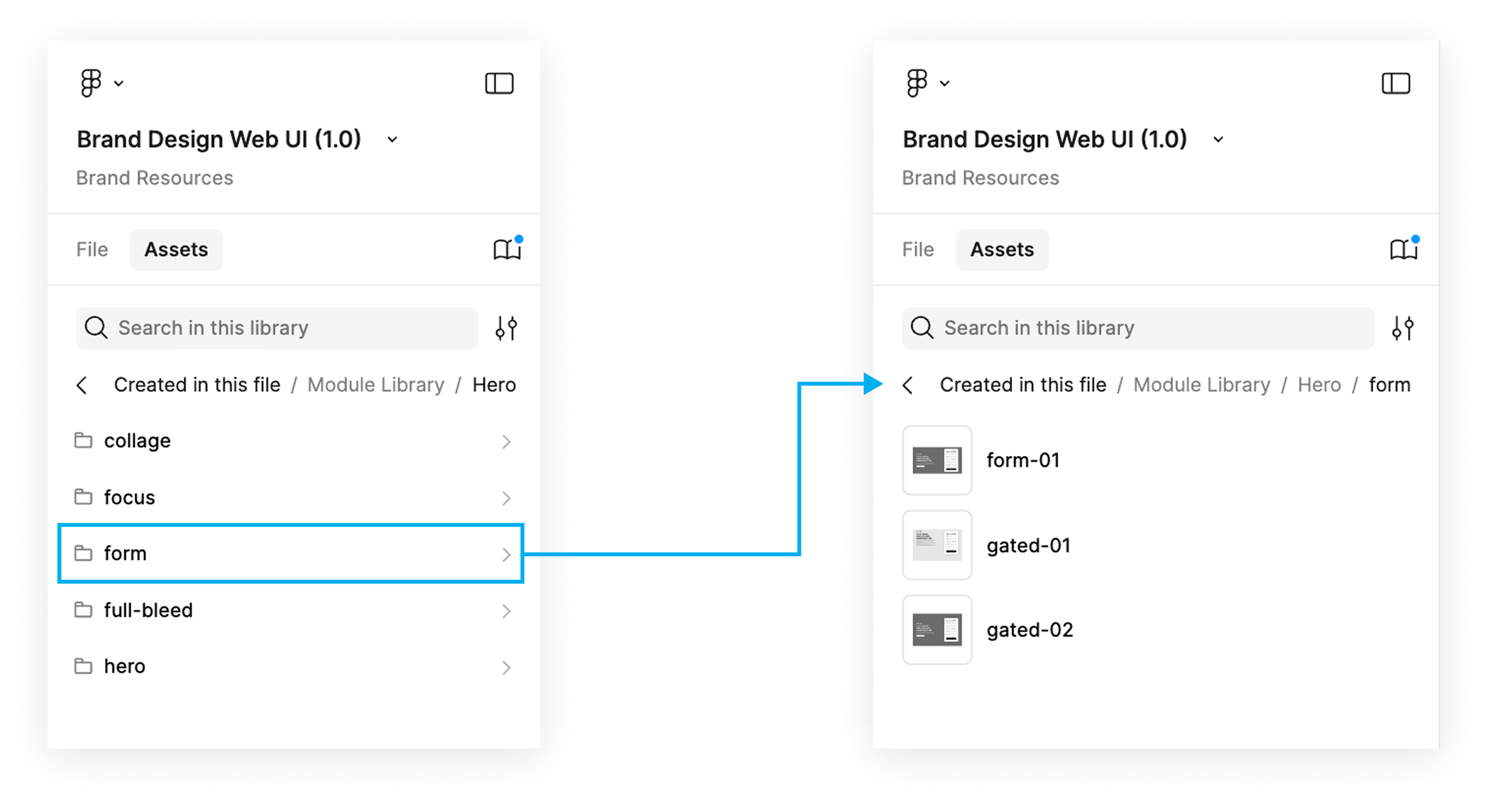
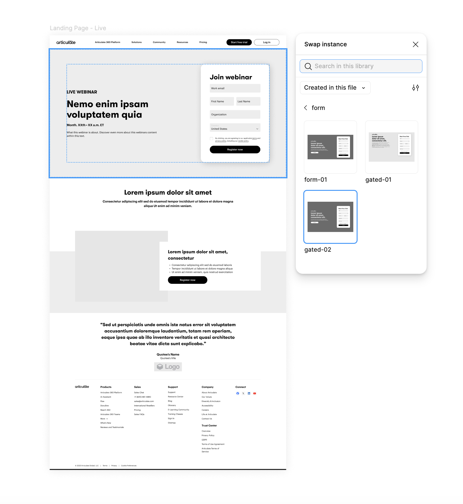
Website Modules
Module Components
Icon and Illustration library
Sizing
Buttons
Spacing


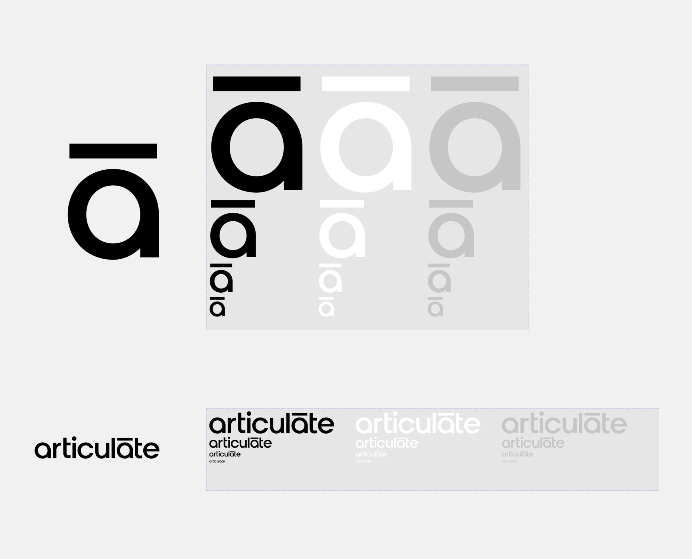
Logos
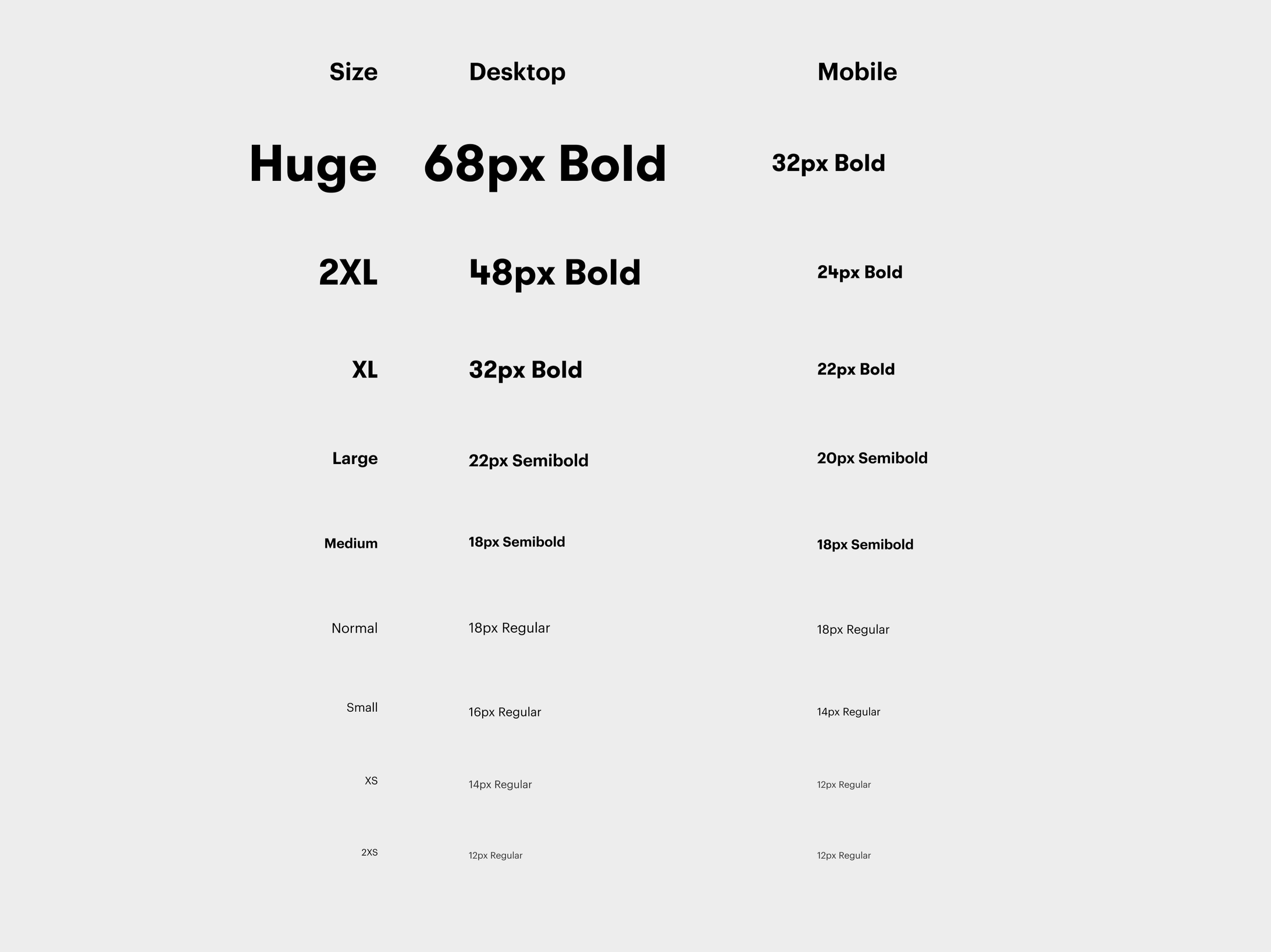
Systemized Type Scale for Web

Website Modules
Illustrations
Spots

Badges